
In 2025, businesses are overwhelmed with data, yet only 20% fully utilize it. AI tools for data visualization are essential for transforming raw numbers into actionable insights. This article compares five popular platforms – Quadratic, Tableau, Power BI, Qlik Sense, and Domo – highlighting their strengths, features, and pricing to help you choose the right tool for your needs.
Key takeaways:
- Quadratic: Spreadsheet-like interface with AI-driven natural language queries for easy chart creation. Lacks extensive integrations.
- Tableau: Handles massive datasets with advanced customization but requires a higher budget and technical expertise.
- Power BI: Affordable and integrates well with Microsoft products, but advanced features may require upgrades.
- Qlik Sense: Focuses on interactive data exploration but can be complex and costly.
- Domo: Cloud-based with strong collaboration tools but pricing varies significantly.
Quick Comparison
| Tool | Starting Price | Key Strengths | Limitations |
|---|---|---|---|
| Quadratic | N/A | Natural language queries, simplicity | Limited integrations, newer tool |
| Tableau | $15/user/month | Large datasets, deep customization | Costly, steep learning curve |
| Power BI | $10/user/month | Affordable, Microsoft integration | Limited free version, scaling cost |
| Qlik Sense | Custom pricing | Associative data model | Complex setup, higher costs |
| Domo | ~$20,000/year (estimate) | Cloud-native, collaboration features | Pricing details less transparent |
Choosing the right tool depends on your budget, technical skills, and data needs. Pairing these platforms with precise AI prompts can further enhance your visualizations.
Best AI Tools Every Data Analyst Should Know in 2025
1. Quadratic
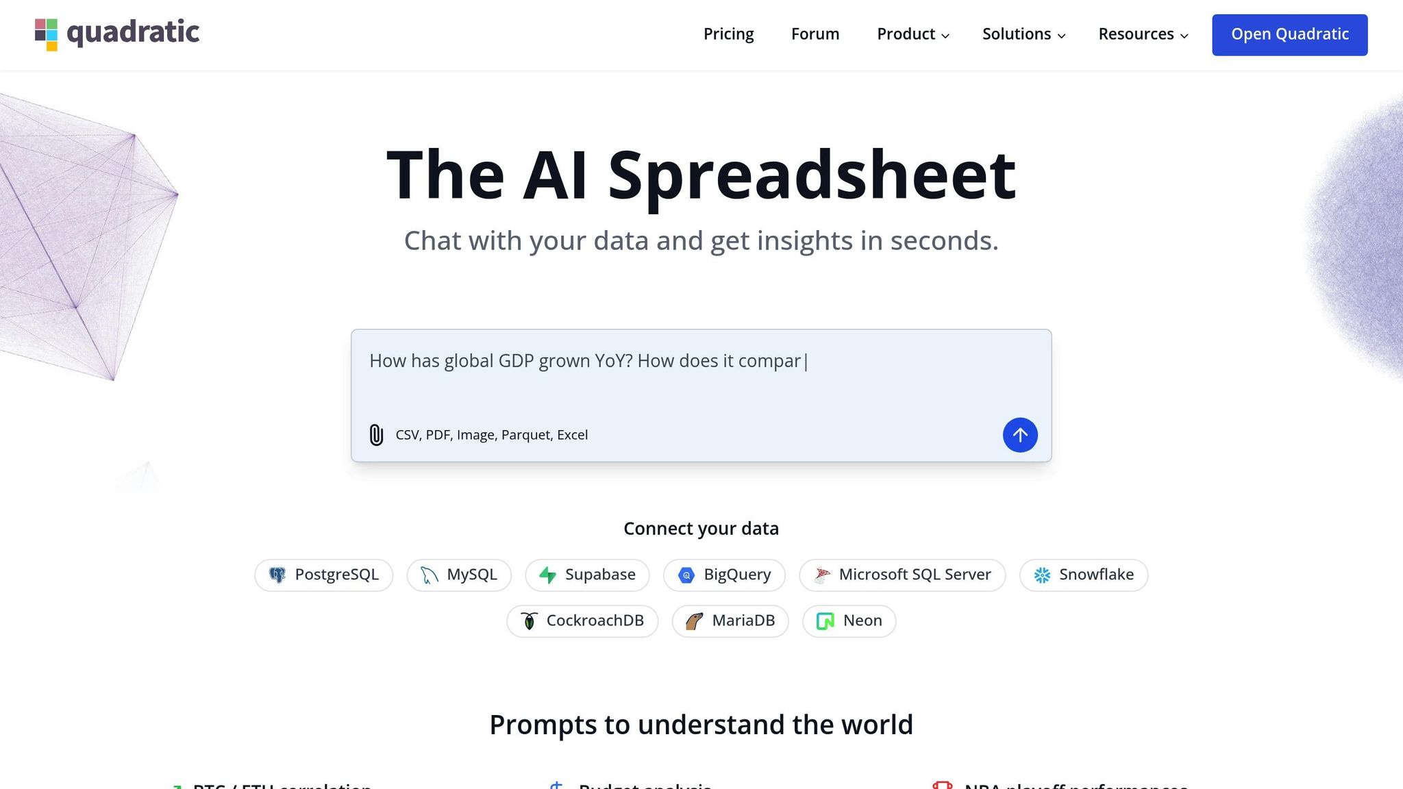
Quadratic combines the simplicity of traditional spreadsheets with the power of AI-driven visualization tools. Unlike standard spreadsheet software, it allows users to create data visualizations using straightforward natural language commands, making it an intuitive choice for both beginners and experts.
AI/ML Capabilities
Quadratic stands out with its ability to recommend the most suitable chart types based on your data. It supports a variety of visualization formats, including bar charts, pie charts, area charts, line graphs, scatter plots, histograms, and column charts.
What makes it even more impressive is its natural language engine. Users can simply describe what they need (e.g., "create a bar chart showing sales by region, sorted in descending order"), and Quadratic will generate the corresponding visualizations.
Customization Options
Customization is where Quadratic truly shines. Its AI-generated visuals can be tailored to fit specific brand guidelines or personal preferences. Users can easily adjust colors, labels, axes, and legends. The platform also supports building and refining dashboards directly within spreadsheets, offering a seamless workflow.
For those who need more advanced options, Quadratic allows in-cell coding using Python, SQL, and JavaScript. This feature enables users to apply complex logic and craft detailed visualizations. With built-in support for Plotly libraries in Python and Chart.js for JavaScript, the platform offers flexible and robust visualization tools.
Next, we’ll dive into Tableau’s unique features as we continue comparing top data visualization tools.
2. Tableau
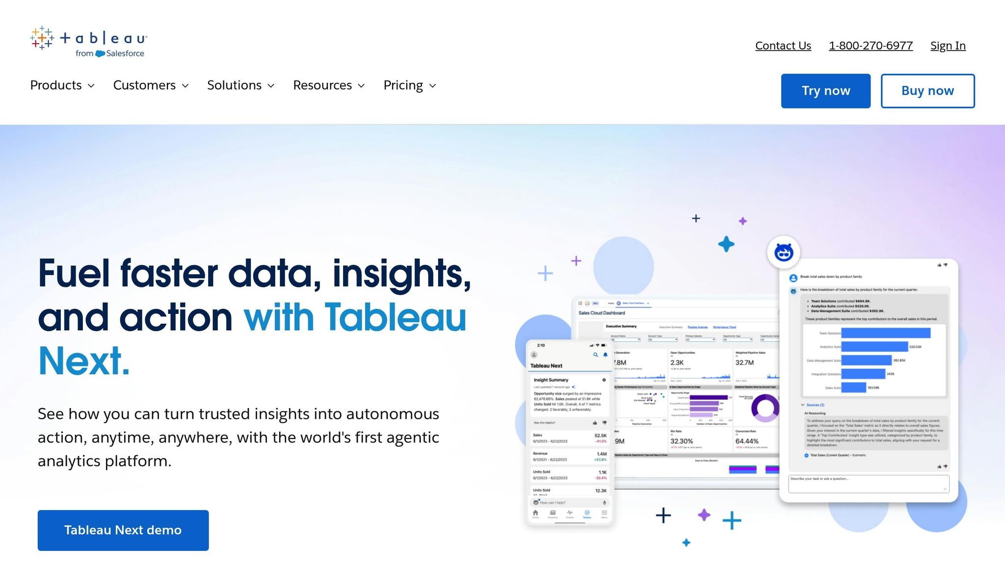
Tableau is a powerful tool for turning raw data into visual insights, offering enterprise-grade data visualization that’s accessible to both technical experts and non-technical users. Its user-friendly interface and ability to handle complex datasets make it a go-to platform for businesses. Let’s dive into what makes Tableau stand out, from its data integration capabilities to its AI tools, customization options, collaboration features, and pricing.
Data Source Integration
One of Tableau’s biggest strengths is its versatility in connecting to a wide range of data sources. It supports over 75 native connectors, including popular databases like MySQL, PostgreSQL, and Oracle, as well as cloud platforms such as Amazon Web Services, Google Cloud, and Microsoft Azure. Tableau also works seamlessly with spreadsheets, web data connectors, and even real-time streaming data.
With live connections, Tableau ensures that your visualizations reflect real-time data updates. For organizations managing massive datasets, its extract functionality creates optimized snapshots, speeding up performance without compromising data accuracy.
AI/ML Capabilities
Tableau incorporates AI tools that make data analysis more intuitive and insightful. Its Ask Data feature allows users to type plain English questions – like "What were the sales trends by region last quarter?" – and instantly receive visualizations tailored to their query.
The Explain Data feature leverages machine learning to dig into unexpected values or outliers, offering potential explanations for unusual patterns. By analyzing thousands of factors, Tableau highlights the most statistically relevant insights when users click on specific data points.
To make things even easier, Tableau provides smart recommendations for chart types based on your data’s structure. This feature takes into account factors such as data types and visualization best practices, helping users create effective visuals without guesswork.
Customization Options
Tableau offers a highly customizable experience, starting with its drag-and-drop interface that lets users tweak colors, fonts, layouts, and interactive elements. You can even create custom color palettes to match your company’s branding or meet accessibility standards.
For those who need advanced options, Tableau provides tools like calculated fields and parameters for complex data transformations. Its dashboard actions allow users to build interactive experiences, such as filtering data across charts with a single click.
Want a more personalized touch? Tableau supports custom shapes, images, and background maps, enabling unique visual designs. Its web authoring capabilities ensure that any customizations remain consistent, whether accessed via desktop or web browsers.
Collaboration Features
Tableau makes teamwork easy with its collaboration tools. Using Tableau Server or Tableau Online, teams can share workbooks, allowing others to view, comment on, or edit visualizations based on their access permissions. Built-in version control helps track changes and roll back to earlier versions if needed.
The platform also includes subscription and alerting features, which automatically send scheduled reports to stakeholders. Data-driven alerts can notify users when specific metrics hit predefined thresholds.
Adding to its collaborative edge, Tableau’s commenting system lets users discuss data directly within dashboards, eliminating the hassle of switching to external communication tools. Plus, its mobile optimization ensures that collaboration continues smoothly across devices.
Pricing
Tableau offers a per-user licensing model with three main tiers:
- Tableau Creator: Priced at $75 per user per month, this tier includes full authoring capabilities across desktop, web, and mobile platforms.
- Tableau Explorer: Available for $42 per user per month, it focuses on web-based editing and interaction with published content.
- Tableau Viewer: At $15 per user per month, this option is for users who primarily view dashboards and reports without editing them.
Organizations often mix and match licenses to balance costs and meet various user needs. Discounts are available for enterprise clients, along with special pricing for academic institutions and non-profits.
3. Power BI
Microsoft Power BI stands out as a top-tier business intelligence tool, blending advanced analytics with seamless integration into the Microsoft ecosystem. Its user-friendly design and enterprise-level features make it a favorite for organizations already leveraging Microsoft technologies. Here’s a closer look at its connectivity, AI-driven tools, customization options, collaboration features, and pricing.
Data Source Integration
Power BI connects to over 100 data sources, including well-known databases like SQL Server, Oracle, and MySQL, along with cloud services such as Salesforce, Google Analytics, and Adobe Analytics.
One standout feature is DirectQuery, which provides real-time access to data without the need for importing it. This is particularly useful for organizations managing large datasets where up-to-date information is critical. Additionally, Power BI supports composite models, allowing users to blend imported data with DirectQuery sources within a single report.
Another key tool is dataflows, which simplifies data preparation. Users can extract, transform, and load data from multiple sources into a centralized hub, streamlining data management across reports and dashboards. This strong connectivity lays the foundation for Power BI’s AI-powered analytics.
AI/ML Capabilities
Power BI makes advanced analytics accessible, even for those without technical expertise, by embedding artificial intelligence into its features. For instance, the Q&A feature, powered by Azure Machine Learning, lets users type natural language queries like "show sales by region this year" to generate visual charts effortlessly.
The Key Influencers visual employs machine learning to uncover factors driving specific outcomes. For example, when analyzing customer churn, it highlights the variables most affecting retention rates, offering actionable insights without requiring deep statistical knowledge.
Other AI-driven tools include the Decomposition Tree, which allows users to explore data hierarchically, and Smart Narrative, which automatically generates written summaries of key dashboard insights. The Anomaly Detection feature keeps an eye on data streams, flagging unusual patterns or outliers. These advanced tools work hand in hand with Power BI’s extensive customization options.
Customization Options
Power BI offers a wide range of customization features, starting with its custom visuals marketplace, which includes hundreds of specialized charts and graphics developed by Microsoft and third parties. For those with technical skills, the Power BI SDK and web technologies like D3.js can be used to create entirely custom visuals.
Users can also personalize their reports with themes and formatting options, enabling them to apply custom color schemes, fonts, and layouts. Conditional formatting ensures visuals dynamically respond to data changes, while bookmarks let users craft guided storytelling experiences within their reports.
For advanced calculations, Power BI’s DAX (Data Analysis Expressions) language provides the flexibility to create custom measures and calculated columns, enabling complex analytics without traditional coding.
Collaboration Features
Power BI promotes teamwork through its workspaces, where teams can collaborate on reports and dashboards in real time. The platform also supports row-level security, ensuring users only access data relevant to their roles.
With Power BI Apps, dashboards can be packaged and distributed to specific audiences. The subscription feature allows reports to be delivered via email on a set schedule, while data alerts notify users when metrics exceed predefined thresholds.
Collaboration is further enhanced through the commenting system, enabling discussions directly within reports. The platform’s mobile apps ensure users can stay connected on the go, and integration with Microsoft Teams brings analytics directly into team conversations and meetings.
Pricing
Power BI offers three main licensing options to fit different needs:
- Power BI Pro is priced at $10 per user per month, providing full authoring, sharing, and collaboration capabilities. It includes 10 GB of storage per user, making it ideal for most business users creating and sharing content.
- Power BI Premium Per User costs $20 per user per month and includes advanced features like AI tools, larger dataset capacities, and faster refresh rates. This tier is tailored for power users requiring sophisticated analytics.
- Power BI Premium Per Capacity starts at $5,000 per month, offering dedicated cloud resources and unlimited content consumption. This option is designed for enterprises with a large number of viewers who don’t need authoring capabilities.
For developers, Microsoft also provides Power BI Embedded, which allows analytics to be integrated into custom applications. Pricing for this option is based on usage and capacity requirements.
4. Qlik Sense

Qlik Sense provides powerful tools for customizing visuals, giving users the ability to design dashboards that update dynamically in real time. Here’s how it makes personalized dashboard creation straightforward and effective.
Customization Options
Qlik Sense’s styling panel offers a wide range of options to tweak and tailor visualizations. Users can modify chart titles, subtitles, footnotes, and even include dynamic expressions that update as data changes. For example, by using an expression like:
='Total Sales: ' & Round(Sum(Sales)/1000000, 0.1) & 'M',
a chart title can dynamically display total sales, such as "Total Sales: 12.3M".
The platform also allows users to fine-tune visual presentations based on the type of chart. For instance, a bar chart with two dimensions can be switched from a grouped layout to a stacked format by navigating to Appearance > Presentation and selecting "Stacked." This makes it easier to compare monthly quantities at a glance.
Qlik Sense includes additional tools to enhance customization. The Layout Container feature enables users to create freeform dashboards with custom key performance indicators (KPIs), offering a more interactive experience. Luis Felipe Tensini highlights this as a standout feature. Another handy tool is Cyclic Group Dimensions, which lets users toggle between different chart dimensions dynamically. Plus, the ability to copy and paste styling ensures that designs can be applied consistently across multiple visualizations.
"A picture is worth a thousand words, but a visualization can tell a million stories."
- QlikProductUpdates, Employee, Qlik
Next, we’ll explore Domo’s features to round out the comparison.
sbb-itb-58f115e
5. Domo
Domo is a cloud-based business intelligence (BI) platform designed to bring teams together through real-time collaboration and seamless data integration. By embedding social features directly into its analytics tools, Domo transforms how teams interact with data.
Data Source Integration
Domo stands out for its ability to connect a variety of data sources, thanks to its cloud-native architecture. Its consumption-based pricing model includes everything from data storage and ingestion to visualization, Magic ETL, and real-time data fetching. This setup ensures that integration scales effortlessly with usage.
Collaboration Features
One of Domo’s defining strengths is its focus on collaboration. Its Buzz chat application allows teams to discuss insights, assign tasks, and take action – all without leaving the platform. The Profiles feature goes a step further by showcasing detailed organizational charts, including team locations, groups, activities, and even social networks. This helps users better understand team dynamics and fosters stronger working relationships.
Other collaboration tools include:
- Projects & Tasks: A feature for managing tasks with clear ownership and accountability.
- Scheduled Reports: Automatically sends dashboard snapshots via email, complete with actionable links to the data.
- Alerts System: Notifies users of critical data changes through web, email, or mobile alerts, enabling faster decision-making.
One Director of Sales shared their experience:
"The best way to generate collaboration and teamwork among our sales teams is through Buzz. While they are on the sales floor we can keep a pulse of the business and continue to motivate and help each other."
Nicholas Hughes, Associate Director of Revenue Analytics, also noted:
"Domo shifted our reporting from a highly-siloed structure to one built upon interdepartmental collaboration and trust."
These features make Domo a powerful tool for teams seeking to work more cohesively.
Customization Options
Domo offers extensive customization options to meet diverse business needs. Granular access policies ensure that team members only see the data relevant to them, while still allowing for broad sharing when needed. Its Workspaces feature brings together Apps, Dashboards, Cards, DataSets, and DataFlows, all organized with intuitive folder tools and robust search capabilities.
For on-the-go collaboration, Domo’s mobile app provides real-time access to dashboards, data analysis tools, visualization editing, alerts, and team communication – all from any device.
Pricing
Domo uses a consumption-based pricing model with three main tiers: Standard, Enterprise, and Business Critical. Pricing details are available upon request, with costs typically ranging between $20,000 and $100,000 annually. While cost and user experience are important, organizations should also keep in mind the role of ai data quality in getting reliable insights from any visualization platform..
Now that we’ve explored these five leading AI data visualization tools, let’s take a closer look at their respective strengths and weaknesses.
Advantages and Disadvantages
Every tool comes with its own set of strengths and challenges, tailored to meet different organizational needs, budgets, and expertise levels.
Quadratic stands out with its AI-driven natural language queries and the ability to create charts quickly without needing any coding skills. Its modern web architecture allows for seamless creation of interactive visuals. However, being a relatively new platform, it lacks the extensive community support and third-party integrations that more established tools offer.
Tableau is well-known for its ability to process massive datasets, handling millions or even billions of records efficiently. That said, the cost of its paid versions can be prohibitive for smaller organizations, and mastering its advanced features often requires a significant learning curve.
Power BI offers a middle ground between functionality and affordability, with pricing that’s more accessible than Tableau. However, the free version has limitations, and organizations needing advanced analytics or enhanced sharing capabilities must opt for Pro or Premium subscriptions. These upgrades can become costly for larger teams.
Qlik Sense sets itself apart with its associative data model, which allows users to explore data intuitively and uncover hidden relationships. While it provides deep analytical capabilities, its setup can be complex and expensive, especially for larger organizations.
Domo, a cloud-native platform, is designed specifically for data visualization. Its subscription-based model makes it a flexible option for organizations seeking cloud solutions. However, detailed comparisons of its pros and cons are less readily available.
Below is a table summarizing the key advantages and disadvantages of these tools:
| Tool | Key Advantages | Primary Disadvantages |
|---|---|---|
| Quadratic | AI-driven natural language queries, fast performance, no coding needed | Limited community resources and third-party integrations |
| Tableau | Intuitive interface, handles very large datasets efficiently | High cost, steep learning curve for advanced features |
| Power BI | Budget-friendly, drag-and-drop interface | Limited free version, rising costs for larger teams |
| Qlik Sense | Associative data model, reveals hidden relationships | Complex setup, higher costs for large-scale use |
| Domo | Cloud-based platform | Limited detailed comparisons available |
Choosing the right tool depends on your specific data needs. Whether it’s the affordability of Power BI, the AI-powered simplicity of Quadratic, or the analytical depth of Qlik Sense, each option has something unique to offer. Next, we’ll dive into how AI prompts can take data visualization to the next level.
Using AI Prompts for Better Data Visualization
The tools we’ve discussed so far are undeniably powerful, but their true potential shines when paired with thoughtful prompt engineering. AI prompts serve as clear instructions, steering AI tools to produce more accurate charts and deliver insights faster.
The key to successful AI-driven visualizations lies in crafting specific, contextual prompts. A vague request like "create a chart" won’t cut it. Instead, effective prompts should address the audience, the story you’re trying to tell, and the key takeaways. For instance, a strong prompt might say: "Generate a quarterly sales comparison chart for an executive presentation, focusing on significant Q3 growth and highlighting regional performance differences." This level of detail not only enhances chart quality but also sets the stage for leveraging tools like God of Prompt.
God of Prompt offers a vast library of categorized AI prompts, including a Complete AI Bundle with lifetime updates, which simplifies workflows for businesses across the United States. These prompts aren’t just about making charts – they help with selecting the right type of visualization, ensuring consistent styling, and crafting narratives that bring clarity to complex data.
The impact of well-structured AI prompts on businesses is hard to ignore. Companies using these prompts report faster turnaround times for dashboards and reports. Templates for prompts have proven particularly useful, especially in standardizing visualization outputs across teams. When analysts stick to consistent prompts, organizations achieve a unified look in their reporting. This consistency is crucial for U.S. businesses operating across multiple departments or locations, as it fosters trust and supports quicker decision-making.
Much like tools such as Tableau or Power BI, refining prompts through iteration takes visualizations to the next level. If an initial chart doesn’t meet expectations, structured prompts make it easy to adjust details like color schemes, data ranges, or annotations. This makes the revision process faster and more efficient.
Combining AI prompts with existing visualization tools creates a hybrid workflow that balances creativity with precision. For example, AI can handle the initial setup and design in tools like Tableau or Power BI, while human expertise fine-tunes the final product and ensures strategic insights are well-communicated.
For U.S. businesses, prompt engineering also tackles challenges like regulatory compliance and accessibility standards. Thoughtfully crafted prompts can help ensure visualizations meet Section 508 requirements for federal contractors or include necessary disclaimers for financial presentations. By addressing these compliance needs upfront, businesses save time during reviews and approvals, paving the way for more streamlined and effective data visualization strategies.
Conclusion
Selecting the right AI data visualization tool means carefully evaluating your organization’s specific needs, technical expertise, and budget. Each tool has distinct strengths tailored to different business scenarios.
Here’s a recap of the standout features for each tool:
- Quadratic: Perfect for teams transitioning from Excel, Quadratic offers a spreadsheet-like interface enhanced with AI capabilities. Its familiar setup lowers the learning curve while providing advanced insights.
- Tableau: Known for its versatility and deep customization options, Tableau is ideal for enterprises with dedicated data teams and larger budgets. It’s a go-to choice for handling sophisticated data analysis.
- Power BI: A great fit for businesses already using Microsoft products, Power BI integrates seamlessly with Office 365 and Azure. It delivers powerful features at a competitive price, making it a practical choice for Microsoft-centric organizations.
- Qlik Sense: Best for those who value interactive data exploration, Qlik Sense stands out with its associative analytics approach. It’s a top pick for organizations that prioritize self-service capabilities and dynamic data relationships.
- Domo: Designed for mobile-first teams, Domo excels in real-time dashboards and executive-level reporting. Its cloud-native platform is perfect for organizations needing on-the-go insights.
Pairing these tools with well-structured AI prompts can amplify their effectiveness. Thoughtful prompt engineering not only enhances visualization quality but also speeds up insight generation. Resources like God of Prompt’s library can help standardize your approach, ensuring consistent and actionable results across your organization.
When choosing a tool, consider your team’s size, technical proficiency, and data needs. For small to medium businesses, Power BI or Quadratic strike a balance between functionality and ease of use. Larger enterprises with complex data challenges may benefit more from Tableau or Qlik Sense, while Domo is a strong contender for mobile-focused operations.
FAQs
How does Quadratic make data visualization easier for non-technical users with AI-driven natural language queries?
Quadratic makes data visualization accessible to everyone, even those without technical expertise. By using natural language queries, users can simply type conversational prompts to create charts, graphs, and reports – no coding or advanced skills required.
This user-friendly method streamlines data analysis, allowing users to quickly uncover insights and make decisions without wrestling with complicated tools or processes.
What should businesses consider when deciding between Tableau and Power BI for data visualization?
When choosing between Tableau and Power BI, businesses need to weigh their specific needs and priorities. Tableau stands out for its advanced data visualization tools and a high degree of customization, making it ideal for diving deep into complex datasets. Meanwhile, Power BI shines with its seamless integration into the Microsoft ecosystem, efficient handling of large datasets, and interactive dashboards that are particularly intuitive for users familiar with Microsoft tools.
To make the right choice, consider factors like cost, ease of use, and the desired level of customization. Tableau is often the go-to for detailed data exploration, while Power BI tends to attract businesses seeking affordability and effortless integration with Microsoft products. Evaluating your organization’s goals and technical needs will guide you to the platform that aligns best with your objectives.
When is Domo’s cloud-native platform and real-time collaboration most useful for a business?
Domo’s cloud-based platform is designed to keep businesses in sync with real-time data and foster efficient teamwork. With its instant sharing, communication, and task assignment capabilities, it’s a perfect fit for industries like sales, marketing, and operations – fields where quick, informed decisions are non-negotiable.
For companies with teams spread across the globe, Domo offers secure, round-the-clock access to data. This ensures collaboration flows smoothly across time zones, cutting down on delays and boosting productivity in fast-moving work environments.