Create a brand moodboard with AI that looks like a creative agency made it


Most brands do not fail because their product is bad.
They fail because they look inconsistent.
Their website feels “premium,” their Instagram feels random, their ads feel cheap, and their logo looks like it belongs to a different company. The result is simple: people do not trust the brand, even if the offer is great.
A brand moodboard fixes that.
It is not a collage of pretty pictures. It is a visual system that defines what your brand should feel like before you design anything. It sets the rules for color, photography, typography, texture, and style — so every future design decision becomes easier.
Now AI makes moodboarding unfairly fast.
If you know how to prompt correctly, you can generate 3–5 strong brand directions in under an hour and build a moodboard that looks like something you would see in a professional branding deck.
Let’s break down the exact mindset and prompt frameworks to do it.
A moodboard is not “inspiration.” It is a brand direction.
If you want a moodboard that actually works, stop thinking like a Pinterest user.
Start thinking like a brand designer.
A strong moodboard does three things:
- It creates a visual identity atmosphere
- It sets a repeatable aesthetic
- It helps you say “no” to visuals that do not belong
The goal is not to collect images you like.
The goal is to define a world your brand lives in.
The fastest way to get a clean moodboard is to define 5 brand signals
Before you generate anything, lock these in:
Brand vibe
What emotion should the brand trigger instantly?
Examples:
- Calm and clean
- Loud and rebellious
- Elegant and minimal
- Playful and colorful
- Dark and cinematic
- Futuristic and sleek
Visual style reference
You need a design language anchor.
Examples:
- Scandinavian minimalism
- Editorial magazine layout
- Japanese packaging design
- Brutalist typography
- Luxury beauty campaign photography
- Streetwear poster collage
Color palette direction
You do not need exact hex codes yet. You need the vibe.
Examples:
- Warm beige + ivory + muted gold
- Deep black + silver + neon green
- Pastel pink + cream + soft blue
- Earthy brown + clay + forest green
Photography direction
This is where most brands mess up.
Examples:
- Soft natural lighting, close-up shots
- High contrast studio lighting, sharp shadows
- Film grain lifestyle photography
- Ultra-clean product photography on white
Texture + materials
Textures create “feel.” AI moodboards without texture look generic.
Examples:
- Paper grain
- Linen fabric
- Marble
- Chrome
- Concrete
- Matte plastic
- Neon glow
When you have these 5 signals, prompting becomes easy.
Moodboard prompting is not one prompt. It is controlled variation.
The reason most AI moodboards look messy is because people generate random outputs and try to force them together.
The correct approach is to generate multiple brand directions, then choose one that feels like the strongest “world.”
You are not making a moodboard yet.
You are exploring identity options.
Think like this:
- Direction A: “Minimal luxury”
- Direction B: “Bold modern”
- Direction C: “Soft organic”
- Direction D: “Futuristic tech”
Once you find the winner, you curate the moodboard around it.
Use this “Moodboard Prompt Formula” (copy-paste)
Here is the core prompt template you should use for any brand:
Moodboard Prompt Formula
Brand moodboard for a [type of brand], designed for [target audience], visual identity inspired by [style reference], color palette includes [colors], photography style is [photo direction], design elements include [textures/materials], typography inspiration is [font vibe], aesthetic is [3–5 keywords], cohesive, high-end branding, professional layout, moodboard collage, clean composition, modern.
This prompt works because it forces the AI to think like a designer, not like an artist.
Now here are some plug-and-play versions.
Prompt Pack: Brand Moodboards That Actually Look Premium
Luxury skincare moodboard prompt
Brand moodboard for a premium skincare brand designed for modern women, visual identity inspired by high-end editorial beauty campaigns and Scandinavian minimalism, color palette includes warm beige, ivory, muted gold, and soft gray, photography style is soft natural lighting with clean close-up product shots, design elements include marble texture, linen fabric, glass packaging, minimal labels, typography inspiration is elegant serif headlines with modern sans-serif body text, aesthetic is calm, refined, minimal, luxurious, cohesive moodboard collage, professional layout.
Streetwear brand moodboard prompt
Brand moodboard for a streetwear brand designed for Gen Z creators, visual identity inspired by underground music posters and modern Tokyo street culture, color palette includes black, neon green, white, and deep red accents, photography style is gritty urban flash photography, design elements include graffiti textures, sticker overlays, bold typography, ripped paper edges, typography inspiration is condensed sans-serif and brutalist type, aesthetic is rebellious, energetic, bold, futuristic, cohesive moodboard collage layout.
Wellness / spa moodboard prompt
Brand moodboard for a wellness and mindfulness brand designed for busy professionals, visual identity inspired by modern spa branding and natural minimalist design, color palette includes soft sage green, cream white, warm clay, and muted sand, photography style is soft warm lighting with lifestyle wellness scenes, design elements include organic textures, handmade paper grain, natural stone, subtle patterns, typography inspiration is soft rounded sans-serif fonts, aesthetic is calming, clean, grounded, modern, cohesive moodboard collage.
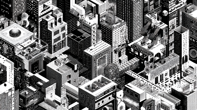
Tech startup moodboard prompt
Brand moodboard for an AI startup designed for modern businesses, visual identity inspired by futuristic UI design and minimal product branding, color palette includes deep navy, electric blue gradients, white, and soft violet accents, photography style is clean high-tech lighting with abstract technology visuals, design elements include glassmorphism, subtle grid layouts, minimal icons, smooth gradients, typography inspiration is geometric sans-serif fonts, aesthetic is sleek, futuristic, premium, minimal, cohesive moodboard collage layout.
The “Consistency Trick” that makes AI moodboards look intentional
Most people generate 20 images that do not match.
Then they wonder why the moodboard looks like chaos.
The trick is simple:
Use one aesthetic direction, then repeat it with controlled variations.
Instead of generating “brand moodboard,” generate these categories separately:
- hero photography
- packaging inspiration
- texture backgrounds
- typography inspiration layouts
- icon style references
- UI references (optional)
Then combine them.
This gives you cohesion.
It is the difference between a random collage and a real brand system.
Some creators even generate visuals in one tool, then test alternate variations in another (for example using the Grok image generator for fast experimentation), but the key is always the same: do not mix completely different visual universes.
Build the moodboard like a designer: 12 images max, no exceptions
A professional moodboard is curated.
If you include 40 images, your moodboard becomes noise.
Aim for:
- 3 hero visuals (the “brand feeling”)
- 3 photography references
- 2 texture references
- 2 typography references
- 2 packaging/UI/icon references
That is enough to define the brand.
More than that and your audience stops understanding what the brand is.
Want it to look expensive? Add brand language, not just visuals.
A moodboard becomes 10x more powerful when you add short labels.
Examples:
- “Photography: soft natural light, clean shadows, close-up framing.”
- “Typography: elegant serif headlines, minimal sans-serif body.”
- “Textures: paper grain + marble + matte glass.”
- “Color vibe: calm neutrals with subtle gold accents.”
- “Composition: lots of white space, premium editorial layout.”
These micro-notes turn your moodboard into a brand direction document.
It stops being “inspiration” and becomes a guide.
Extract a clean color palette from your AI moodboard
Once your moodboard looks cohesive, lock in your palette.
Pick:
- 1 primary color
- 2 secondary colors
- 2 neutrals
- 1 accent color
Then name them.
Yes, name them.
That small detail instantly makes your brand feel professional.
Examples:
- Sandstone Beige
- Linen White
- Clay Gray
- Soft Gold Accent
- Midnight Charcoal
This is what real brand decks do.
Final thought: AI moodboarding is a superpower if you treat it like design
If you prompt randomly, you get random results.
If you prompt like a creative director, you get brand identity.
The goal is not to generate pretty images.
The goal is to build a visual universe your brand can live inside — so your website, ads, social content, and packaging all feel like they belong to the same company.
AI gives speed to your brand, and your job is curating it.
That is the difference between a brand that looks cheap and a brand that looks unforgettable.
Loved by Business Owners


Based on 1K reviews
Get smarter on AI every week.
Ready to transform your business?


Claude Code in 2026: The Complete Beginner's Guide (Installation, Features & Real Examples)
Complete Claude Code guide for 2026: installation, setup, prompting techniques, slash commands, keyboard shortcuts, good vs bad examples. Master Anthropic's AI coding tool from beginner to power user.
Alex Prompter